

What is Descriptive Correlational Research Design?
Descriptive correlational research design is used to uncover relationships between variables without manipulating them. In this method, researchers can observe and analyze how two or more characteristics interact in their natural settings. Instead of intervening, you simply listen and observe—a principle at the heart of customer-centric practices.
This design is useful when experimental methods are impractical or unethical. For instance, you will not create intentional customer dissatisfaction just to see how it affects loyalty. Instead, you can measure existing dissatisfaction levels and correlate them with churn rates.
CX teams could be evaluating customer satisfaction levels across different demographics, or analyzing how service wait times correlate with Net Promoter Scores (NPS). A descriptive correlational research design helps you discover meaningful connections between metrics. The keyword here is correlational: it reveals how variables move together but not whether one causes the other.
To conduct descriptive correlational study:
- Define research questions
- Identify key variables
- Collect data using reliable survey tools
- Implement Pearson’s correlation coefficient, a statistical technique
- Determine the strength and direction of the relationship between variables
- Visualize findings with scatterplots or correlation matrices
Correlational Studies: Key Components And Characteristics
Descriptive correlational studies focus on observation—not intervention. It seeks to determine whether, and to what degree, a relationship exists between variables in real-world settings.
Types of variables in correlational studies
In most descriptive correlational studies, you will deal with two main types of variables:
- Independent variables (IV): These are the presumed cause or influencer in your research. They are not manipulated, just observed.
- Dependent variables (DV): These are the outcomes or results you are measuring in relation to the independent variables.
Clearly define both IV and DV for selecting the right statistical techniques and ensuring data validity.
Common data sources used for correlational studies
Correlational research draws from both primary and secondary data sources. These may include:
- Online surveys and mobile data collection
- Behavioral or transactional analytics
- Archived datasets and public databases
However, real-time data sources from WhatsApp or chatbot-based survey tools can significantly improve response rates. Implement to collect up-to-date insights from specific personas
Measurement scales in correlational research
Identifying the correct measurement scales impacts which correlation analysis you use:
- Nominal / ordinal scales: Best analyzed using Spearman’s rank correlation or Cramer’s V.
- Interval / ratio scales: Allows for more nuanced methods like Pearson’s correlation.
Tip: Use a measurement scale guide before collecting data to avoid mismatched analysis methods.
Understanding these foundational elements prepares you to choose the right correlation analysis for your research question and dataset.
How to Design a Robust Descriptive Correlational Study
Creating an effective study starts with a clear purpose: You’re identifying patterns, not proving causality.
- Create a hypothesis: Example: job satisfaction is positively correlated with employee retention
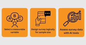
- Select a variable: Select your key variables and ensure each one is measurable through reliable and valid metrics
- Choose representative sample: Choose your population, a sampling strategy and survey them. Use Merren’s multichannel survey strategy. With Merren, you can reach broader and more diverse respondents via WhatsApp surveys, email surveys, and chat surveys. Maximize your response rate minus the friction.
- Design the survey logically: Use Likert or various rating scales, demographic checkboxes etc. The survey formats should gather numeric and categorical data that assist both descriptive and correlational analysis.
- Begin with descriptive analysis: Use mean, median, and standard deviation reveal initial patterns. This gives you a foundation to understand the data landscape before diving into relationships.
- Proceed to correlation analysis: Use Pearson’s r (for continuous variables), Spearman’s rho (for ordinal variables), or point-biserial correlation (for one continuous and one binary variable).
This systematic approach brings clarity, accuracy, and actionability. You move from general trends to specific associations that can support strategic decisions.
Best Practices for Data Collection in Correlational Research
To draw meaningful relationships between variables, your data collection process must be deliberate, systematic, and free from bias. These best practices will help you gather accurate and actionable insights, especially in social and behavioral contexts where human responses can be nuanced.
1. Define variables clearly
Identify variables you aim to correlate. Clearly define how you will measure them, if it is through Likert rating scales, frequency counts, or open-ended responses. This removes ambiguity and brings consistency across your dataset.
2. Choose the right survey channels to reach respondents
Use multiple survey channels where people can offer responses without any bias.Collecting adequate data means meeting people where they are. Using multichannel strategies—like mobile messaging, email, or embedded chatbots—can significantly improve response rates and reduce sampling bias. A WhatsApp-native survey, for example, feels conversational and gets real-time input.
3. Pre-test your survey instruments
Ensure the following tests before publishing a survey: conduct pilot testing, check the clarity of questions, check if the response formats are appropriate. Pre-testing lets you identify confusing language or technical glitches that could skew responses and compromise your correlational analysis.
4. Avoid social desirability bias
Randomizing question order reduces priming effects. Preserving respondent anonymity improves honesty. Both practices help curb social desirability bias, which often taints behavioral data.
5. Monitor real-time data quality
Use tools with real-time dashboards to monitor response patterns. Watch for straight-lining, incomplete submissions, or unusually fast completions. These may indicate low-quality data unsuitable for correlation studies.
“Data quality is the foundation of correlational reliability. Without it, relationships between variables are merely assumptions, not evidence.”
Once your data is collected, the next step is choosing the right statistical methods to analyze relationships.
Step-by-Step Method to Choose the Right Analytical Tools for Correlational Studies
Select the right analytical tool to shape the accuracy of your insights. This section helps you decide which analysis to use and guides you step by step through the process of descriptive and correlational analysis.
Step 1: Start with descriptive statistics
Before diving into correlations, summarize your data using descriptive statistics. Mean, median, standard deviation, and frequency plots reveal basic trends, patterns, and outliers in your dataset. Descriptive stats form the foundation and help you validate data quality and guide your choice of correlation methods.
Step 2: Understand the nature of your variables
- If your variables are continuous and normally distributed, use Pearson’s correlation coefficient. It measures the strength and direction of linear relationships.
- If your data violates normality or includes ordinal variables, Spearman’s rank correlation is more appropriate. This non-parametric method ranks values before assessing their relationship.
Choosing the wrong method can skew results. For instance, Pearson can mislead if the relationship is non-linear—it might estimate a low correlation despite a strong curved pattern.
Step 3: use regression analysis for predictive insights
While correlations show association, regression methods tell you how much one variable predicts another. Simple linear regression works for one predictor and one outcome. For more complexity, like multiple influencing factors, use multiple regression. These tools not only reveal the strength of relationships but also quantify influence.
Quantitative analyses are only as good as the questions they answer. Always ask: Does this analysis match my hypothesis? Is the data sufficient in size and variance?
Interpreting Results and Understanding Correlation Strength
Once your survey responses begin rolling in, the first step is summarizing the data in a way that helps you understand what is happening. High-level summaries from frequency tables, mean scores, medians and percentages help you quickly spot trends, outliers, and respondent patterns. For example, if 78% of respondents rate your service 8 or above, that is a clear signal of strong satisfaction.
However, descriptive statistics only tell you what is happening, not why it is happening. That is where correlational analysis comes in. For instance, is there a link between satisfaction and repeat purchase intent? Or between customer service wait time and Net Promoter Scores? Understanding these correlations can guide where to focus improvements that will make the biggest impact.
When deciding which analysis to use, ask yourself: Am I trying to describe behavior or explain behavior? Use descriptive analysis when you need a snapshot. Use correlational analysis when you want to explore connections and make informed predictions.
Here is a simple step-by-step workflow:
- Start with descriptive statistics – Summarize every key metric. Use visualizations like bar charts or pie charts to quickly interpret patterns.
- Segment your data – Break results by demographics or responsive survey channels or product lines to spot differences.
- Identify hypotheses – Ask what relationships you are curious about. For example: “Are loyal customers more likely to respond via WhatsApp?”
- Run correlation tests – Use pearson or spearman correlations depending on your data type. Look for coefficients above 0.3 or below -0.3 to signal moderate strength.
- Interpret results Thoughtfully – Correlation is not causation. However, strong correlations help you prioritize what to investigate deeper or act upon.
Getting these foundational interpretations right equips your team to listen strategically and act effectively.
Visualizing and Reporting Correlational Data
Effective visualization bridges the gap between numbers and decision-making. It helps stakeholders at every level see not just what is happening, but why.
Start with scatter plots:
Scatter plots show relationships between two variables. A tight cluster of points forming a clear line suggests a strong correlation, while scattered points may imply a weaker or no relationship. You can enhance these visuals by adding trend lines, confidence intervals, or even segmenting by demographic groups to surface deeper insights.
Use correlation matrices:
Matrices offer color-coded for readability, give at-a-glance understanding of the strength and direction of multiple relationships. Be sure to label axes clearly and include a legend if colors are used to represent coefficients.
Tailor reports by audience:
When creating reports, organize findings by key themes or audience needs.
- For executives, highlight business impact: how does variable A drive customer retention or revenue uplift?
- For researchers, provide details like p-values and sample size. Use narrative summaries to complement visuals and make statistical language accessible to non-technical stakeholders.
To decide which type of analysis and visualization is appropriate, ask yourself: What question are you trying to answer? If you are exploring natural relationships between variables without manipulating them, descriptive correlational research is the right fit. Once you know that, move through the process: describe your variables, check assumptions (e.g., linearity, normal distribution), calculate correlation coefficients, and then plot or report accordingly.
When your reporting is clear and aligned with your audience’s needs, data becomes actionable. This makes it easier for teams to listen, understand, and act on real-time feedback.
Examples of Descriptive Correlational Research in Practice
Let us explore how different industries use this method to draw meaningful associations between variables while keeping the focus on listening to people who matter.
Education: linking attendance and academic performance
Researchers often examine the correlation between student attendance and academic achievement. They identify patterns without altering variables. For example, high school administrators might analyze attendance data alongside final grades to assess whether students with higher attendance perform better academically. This type of research informs policy decisions without assuming causation, helping you understand patterns that warrant deeper investigation.
Healthcare: patient lifestyle and chronic illness management
Healthcare professionals explore relationships between patient behavior and disease outcomes. A hospital study may analyze the link between exercise frequency and recovery rates in cardiac patients. These analyses help you identify actionable insights for proactive care protocols without needing complex experimental designs. Such correlations can guide resource allocation and patient education strategies.
Social sciences: social media use and mental well-being
Researchers might explore how time spent on social media correlates with reported levels of anxiety or self-esteem. You can uncover how two naturally occurring variables relate within a population. Understanding these relationships enables more nuanced discussions about digital well-being without making causal assumptions.
Conclusion
Descriptive correlational research allows you to explore real-world problems through an evidence-backed lens. By applying this method across sectors, you move one step closer to understanding how and why things relate—without needing to manipulate variables or environments.
To power your research with an AI-driven tool, sign up on Merren CX. Get a 14 day all-access free trial to supercharge your market research.
You can also create instant surveys using this AI survey marker.